A History of Football Kit Design in England and Scotland
(9) The Designers' Playground (1990-1999)
The question of what distinguishes good football kit design from bad is of course entirely subjective. To a large extent it depends on when your dad took you to watch your local team for the first time. If, like me, this was the mid 1960s, the austere, slimline kits of the period become my benchmark but I can remember old 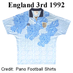 timers on the terraces nostalgically recalling the time when big boots, long baggy shorts and heavy billowing shirts were the thing. It's rather like the way new born chicks are imprinted by the first thing they see when they emerge from their egg.
The Nineties was an extraordinarily devisive decade in the history of football kit design. To its detractors the outfits that appeared were over-elaborate, garish and awful. To those who grew up with them, they are bold, colourful and innovative, reflecting the rebellious confidence of Britpop and lad culture.
Interest in the shirts from the period is such that authentic tops now command premium prices at online retailers and auctions while many outfits that were derided at the time have became highly collectable.
Not only did the appearance of teams change dramatically during the decade, the game itself would undergo a profound transformation. The Taylor Report, commissioned after the Hillsborogh Disaster and published in 1990, recommended that all major stadiums be converted to an all-seated model. Furthermore, all perimeter and lateral fencing would be removed while the new Football Licensing Authority, would oversee safety standards. As a result clubs refurbished or rebuilt their grounds while others sold them off (especially those in prime town centre locations) and used the proceeds to finance a new stadium.
In 1992 Sky Sports, part of Rupert Murdoch's media empire, purchased the rights to broadcast live matches in the newly formed Premier League. This formed a key plank in Murdoch's strategy to build a major subscription based TV network. Over the rest of the decade Sky ruthlessly outbid the BBC, ITV and satellite broadcasters while adding the Football League and Scottish League to its portfolio. This influx of cash reversed decades of economic decline and contributed to the "gentrification" of the sport at higher levels.
Never Mind the Quality, Feel the Width
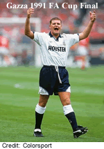 When Tottenham Hotspur stepped out onto the Wembley pitch for the 1991 FA Cup Final they did so wearing novel baggy shirts and mid-thigh shorts. Not only was the outline of the strip unlike any thing seen since the Fifties, it was replete with lots of subtle detailing, including a jacquard pattern printed into the shirt that featured Umbro's double
 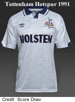 diamond logo, a tab collar with fine stripes on the inner placket, curved panels on the sleeves and shorts decorated on the sleeves with the word "Spurs" and the club crest/Umbro logo on the shorts. The crest also featured on the sides of the socks.
According to research by Christopher Stride, Nick Catley and Joe Headland (Taylor & Francis Online) sales of adult size replica shirts had been growing since 1987 and would surge in 1992-93. Supporters were now wearing these to matches, on the street and in the pub, effectively providing free advertising and generating peer pressure to turn out in the very latest club gear. The subtle detailing on the new Spurs shirt was designed to appeal to this market. In much the same way that Mods in the Sixties would obsess over the width of jacket lapels, the number of buttons sewn into the cuffs and whether a jacket should have one or two vents in the back, this level of detail was invisible to the lay person but essential knowledge for those who wanted to belong to their club's tribe.
During the decade shirts and shorts became ever more loose fitting.
Textures Everywhere
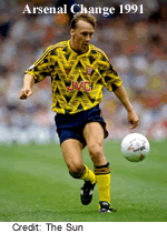 Not every designer went for subtlety as they explored the potential of the new digital printing and weaving technologies. Arsenal's 1991-92 yellow and blue change shirt from 1991-93, affectionately known as the Bruised Banana, may have been derided by purists but it became a firm favourite with fans and was common sight on the streets of north London.
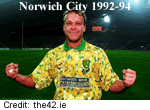 After clinging on to their place in the Premier League in 1991-92, Norwich City qualified for Europe the following season and went on to beat Bayern Munich in 1993-94. During these exploits, the Canaries wore traditional yellow shirts in shiny fabric flecked with white and green, commonly known as "The Bird Poo Kit."
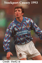 In 1993-94 Stockport County were unbeaten in their last ten games in Division 2 and reached the Division Two play-off final where they lost
  to Burnley. The busy shirts worn during that memorable season were designed by Super League and featured subtly graded bands overlaid with red zig-zag lines.
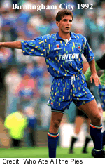
Not every novel kit proved popular with fans. Since 1989 Birmingham City were owned by the Kumar brothers who ran a clothing chain. The rapid succession of managers led to a threat from the players to refuse to renew their contracts. When the Kumars went out of business the club was placed in administration and was bought by David Sullivan of Sports Newspapers much to the relief of supporters. His first act was to replace the unpopular "Paint Box" strip provided by the Kumar's Influence brand with something a bit more 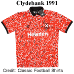 sensible.
Since they joined the Scottish Football League in 1966, Clydebank had picked eye-catching strips so it came as no surprise that they jumped on the new style with 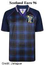 both feet in 1991 with a red shirt decorated with random white and black scratch marks.
Several Scottish clubs experimented with tartan but the most memorable was worn by the Scottish national team at Euro 96. From a distance the strip appeared to be a traditional dark blue but close to the tartan pattern on the body becomes apparent as well as the purple trim at the collar. Known as the "Braveheart" strip after the Mel Gibson film of the same name which was released the previous year, the tartan was commissioned and registered with the Scottish Register of Tartans. The shorts were also tartan.
All the Colours of the Rainbow and Then Some
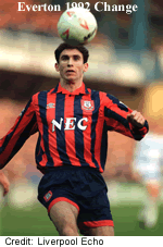 Clubs' first choice (or "home") colours are sacrosanct although additional accent colours had started to appear in the Eighties. There are, however, no restrictions on what can be done with change
  (or "away") strips. In the Nineties many teams took the opportunity to introduce novel colours to their alternative outfits. For example, in 1992 Everton sported striped shirts in salmon pink and navy blue, reviving the colours worn in 1890-91.
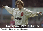
In 1996-97, across Stanley Park Everton's arch-rivals, Liverpool, wore "ecru" shirts, a made up word that sounds better than "beige".
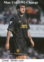 Under Football League regulations, teams were not allowed to wear black (or indeed dark blue) shirts as these clashed with match officals' kit. No such restrictions applied in the Premier League when it was formed in February 1992, however, and
  referees and linesmen were provided with tops in a variety of colours. Manchester United were quick to see the commercial opportunity this presented to shift some novel replica shirts and adopted an all-black change strip in 1993-94.
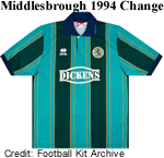
For the 1994-95 season Italian manufacturer Errea delivered a second strip for Middlesbrough in jade and dark green trimmed in navy and amber. Their neighbours and rivals Sunderland were not to be out done and wore a teal change kit trimmed in red 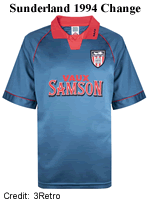 that season.
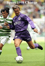 Purple has never been a popular colour in the English and Scottish Football Leagues, possibly because it clashes with both red and blue. As a change colour, however, it has its place and was added to Tottenham Hotspur's colour pallette in 1986, featuring regularly as an alternative to this day. This version dates from 1998-99.
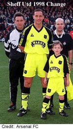
In 1998 Le Coq Sportif created a revolutionary kit for Sheffield United in fluorescent yellow, probably the first time that this eye-scorching colour had been seen on the pitch although fluorescent strips would become popular in the future.
 Traditionally Liverpool have taken a conservative approach to change kits. For decades they
 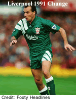 wore white shirts with red trimmings combined with black shorts. Yellow was introduced in 1979 and replaced by grey in 1987. In 1991 they rang the changes again with bottle green and white strips in the new Adidas Equipment template.
Perhaps the most famous example of a novelty colour being introduced was when Umbro provided England with a change strip in two shades of grey (officially "indigo" but let's not quibble). This was worn in the semi-final when England crashed out on penalties to Germany at Wembley Stadium
It was still usual for teams to retain first choice kits for a couple of seasons and 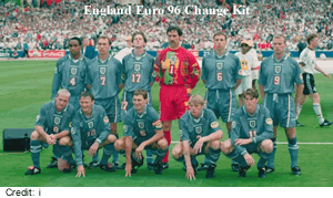 change kits were often recycled after one season as third strips, ensuring that there would be at least one new offering every season. This practice would not last very long.
Misplaced Makeovers
In the Sixties a lot of clubs ditched traditional designs and replaced them with plain single colour shirts, often with contrasting crew necks and cuffs, which were considered more modern. This was a general cultural trend and at least one home improvement programme on the BBC demonstrated how you could cover up old-fashioned Victorian panel doors by covering them with hardboard panels to achieve a 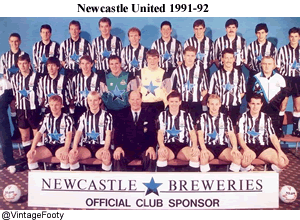 clean, modern look. The new technologies of the Nineties presented football clubs with the same opportunity to update their image but not all of these were successful.
Top of the list is Newcastle United. Their iconic stripes had hardly changed at all in almost a century apart from variations in width, the colour of the central stripe, collars that changed with prevailing fashion and the addition of a crest and later on, sponsorship. Then in 1990 someone at Umbro came up with the idea of combining stripes of different widths on the 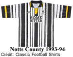 shirt. As one professional designer told me, "It's all very well to blame designers for bad strips but you have to remember that at some stage, that design was approved by the club management."
Notts County were also associated with black and white stripes but had enlivened 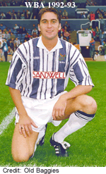 their strips with the addition of amber trimmings since 1989. Their approach to striped shirts was, if anything, even more mad and resulted in this "barcode shirt." West Bromwich Albion combined the idea of stripes of different widths with a rough, hand drawn effect that suggested to the viewer that an early visit to the
 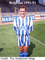 optician would be in order. For good measure, kits in green/yellow and red/yellow were provided in exactly the same template.
Striped shorts had appeared just twice in the entire history of the game and both ended in tears. St Mirren sported a set in August 1962 and received such derision from supporters that they were dropped after a few weeks. Newport County introduced a set in orange and black in February 1972 but after receiving mass ridicule from their own fans in the first two games they were worn in, the players refused to wear 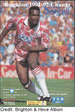 them. Undeterred (or more likely unaware) Brighton & Hove Albion decided in 1991 that what would look best with their new striped shirts would be matching shorts and a legend was born. In the view of many supporters the only thing that was worse this stripey nonsense was the sweety wrapper change kit that accompanied it.
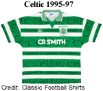 Hoops presented designers with similar challenges. Celtic's hooped shirts are known around the world and are generally treated with respect. They had allowed Umbro to print a pattern made up of double diamonds into the green hoops of the 1993-95 shirts but that is as far as they went. In 1995, however, Umbro produced a shirt with irregular hoops and the word "Celtic" in a classic Irish Gaelic font printed on top of a repeating pattern made up of the club crest, all sublimated into the broader green hoops. Authentic replicas of this classic top are on the market and will set
  you back the best part of £200.
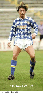
Greenock Morton took a rather more radical approach to their hooped shirts with help from Matchwinner who supplied them with this oddity bearing a pattern 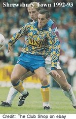 resembling arrow heads. AFC Bournemouth sported the same template but in red and white.
The story may be apocryphal but I was once told that when the chairman of Shrewsbury Town was asked if he had anything in mind for the new 1992-93 kit (which would be designed and produced in-house) he replied that he didn't really care as long as it was flashier than whatever Hereford United were wearing. Because the fabric was cut from large bolts of cloth the pattern on each shirt was unique.
Hull City became known as The Tigers because of their amber and black colours. Once the full potential of the new printing technology became apparent they decided to go all in and commissioned Matchwinner to produce a 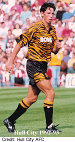
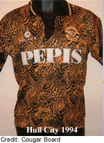 new strip with a bold tiger-print on the shirts. Although it was mocked at the time, it became a firm favourite with supporters and has achieved cult status in the world of football kit anoraks. In January 1994 Pelada took over production but their version had a much smaller, abstract pattern and a dull, almost brown appearance which compares unfavourably with the Matchwinner version.
Bradford City have never been shy of experimenting with novel arrangements of their traditional claret, amber and black colours so it came as no surprise when, in 1991, they appeared in a strip, created by Frontrunner, with large, sloping diamonds and black lining. A few years later, in 1996, 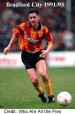 they tried to go one better with halved shirts and shorts in claret and amber, with the colours reversed on the shorts. This did not meet with approval from anyone and was quickly binned in favour of something far more traditional.
One of the cleverest designs of the period was produced by Puma, who were just 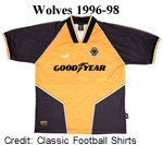 gaining a foothold in the UK market. The shirts produced for Wolverhampton Wanderers in 1996 could not be fully appreciated on the pitch because the central motif wrapped around the players and became partially obscured but when laid out flat it became obvious that the old gold panel on the shirt mimicked the wolf's head in the crest. Furthermore, this shape (complete with ears) was sublimated into the fabric as a repeating pattern.
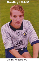 In 1991, Matchwinner came up with a novel design with a fine interference pattern printed into the shirt which Reading adopted. The pattern was only apparent when seen close too and from a distance the shirts appeared to be a rather murky pale
  blue with vague diagonal bands of a slightly darker colour. Bury wore the same template the following season.
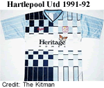
Hartlepool United have worn various shades of blue throughout their history and in 1991 they combined two of them into a checkered shirt designed by Bukta. Although this is indisputably one of the worst kits to emerge from the decade, the sheer complexity of it takes the breath away. In 2019 the club re-released it for collectors.
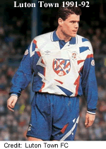 Since 1984 Luton Town had been wearing sober white shirts and dark blue shorts, often with just a little bit of orange trim to remind us of the Seventies. In 1991 they threw caution to the winds and adopted one of Umbro's
  new designs. There really is far too much going on here and even the sponsor's logo for USA (no not that one - it's Universal Salvage Auctions) is busy.
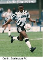
The Jack Hatfield sport shop in Middlesbrough had been a fixture in the north-east since 1970. In 1989 the store had supplied Darlington with a strip that revived their historical black and white hoops, last seen in 1954, with a suitably modern twist. Two years later they came up with a unique design never been seen before or since. The shop closed down in 2018 when the owner, Paul Barry, retired.
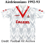 Since 1912 Airdrieonians had worn white strips with a simple red chevron on the front and back of their shirts, earning them the nickname
  of The Diamonds. In 1992 the Danish sportswear company Hummel were awarded the contract to supply a new kit and one can only imagine the disappointment when it was unveiled. The traditional V has been shrunk so that it is now partially hidden by the collar and the entire shirt is disfigured with chevrons in various shades of grey and what looks like white froth. Needless to say Hummel's contract was not renewed.
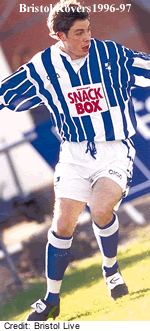
Bristol Rovers' quartered tops present the same dilemma for designers as stripes and hoops, namely how to update them without destroying the strength of 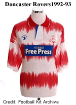 underlying tradition. Combining quarters with stripes was definitely not the way to go. Dismissive fans called this one the Tesco Bag.
Perhaps Matchwinner had more of a grip on this issue as we can judge from their revival of Doncaster Rovers' hoops in 1992. These had been worn in the Thirties and Forties and were briefly revived in the early Eighties. These broad hoops with the blurry edges were far more distinctive than the bland all-red strips that followed, laying the foundation for their return a decade later.
The Kit Suppliers
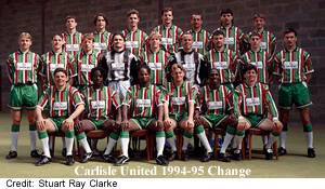 A snapshot of the kit providers in 1992-93 provides a few surprises. The leading supplier was Matchwinner who supplied 19 clubs in the Football League and a further ten in Scotland. The company had emerged in the mid Eighties and had built up a modest roster of clubs on both sides of the border with designs that took full advantage of the emerging new technologies and polyester fabric. Boldness and innovation were their hallmarks, typified by the highly regarded "Deckchair" change kit for Carlisle United. After peaking in 1993-94, Matchwinner's share of the market fell precipitously and by the end of the decade only Forfar Athletic were on their books. Perhaps their problem was that they never broke into the top levels in England or Scotland, which is where money can be made.
Matchwinner was recorded as dormant by Companies House in March 2015 but started trading again in 2023.
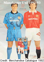 Second in the rankings were Umbro who, in 1992-93, supplied 14 clubs in the Football League, two in Scotland as well as three leading clubs in Italy. They also held the lucrative contracts for the English and Scottish national teams throughout the decade. They were partnered with top teams such as Manchester United, Chelsea, Newcastle United, Aberdeen and Celtic. In the mid-Nineties they expanded their roster globally, signing contracts with Ajax (Netherlands), Velez Sarsfield and San Lorenzo (Argentina), Penarol (Uruguay), RC Lens (France), Fortuna Dusseldorf (Germany), Sevilla and Cordoba (Spain) and many more. How sustainable this strategy would be is a moot point particularly given the challenges they would
  soon face in the UK from the rising global brands but for the time being their position as the leading supplier in the UK seemed secure.
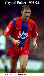
Ribero Sportswear were formed in 1987 and are based in Surrey. Their offer includes bespoke kits designed by the customer as well as a range of ready made outfits. In 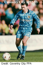 1992-93 they supplied Crystal Palace, then in the Premier League, as well as seven teams in the Football League, some non-league clubs and a couple of Scottish teams. While some of their designs were restrained they were quite capable of turning out the kind of complex, mottled patterns that had become fashionable and illustrated here by Coventry City's strip. Their presence waned rapidly and in 1993-94 Wimbledon were the last professional team to wear Ribero kit. The company is now focussed on supplying sportswear to community football, cricket and bowling clubs and schools.
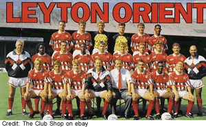 The world's oldest sportswear manufacturer, Bukta, was becoming irrelevant and in 1992-93, they had just five Football League sides on their books. It is hard to pin down just what was going wrong. The company had embraced the new technologies and were producing designs that were no better or worse than those of the competition. It may be that they were not nimble enough to retain their roster in the face of the many small, local sportswear dealers who, as we shall see, were capturing a significant number of contracts in the lower
  divisions.
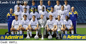
The Admiral logo appeared on the kits worn by four teams in the newly formed Premier League in 1992-93 but this was not the same company that Bert Patrick had set up two decades previously: there was little to distinguish their designs from those of the competition beyond the branding. They were in a strong position at the beginning of the decade and even won a contract to supply kit to Leeds United after they won the last Football League First Division title in 1992. Their presence diminished in the middle of the decade and in 1997 the Admiral trademark was acquired by Hay & Robinson plc.
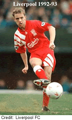 Adidas was in deep trouble financially having been acquired by Bernard Tapie in 1990 for €144 million in leveraged funds. Unable to meet the interest payments, Tapie had
 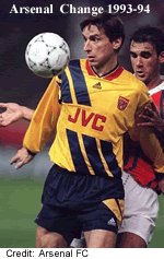 authorised the company's bank to sell Adidas but instead they converted the loan into equity triggering what would become known as the Tapie affair, leading to the businessman serving a 6-month jail term in 1997. Having had a strong presence in the UK since the late Seventies, Adidas in 1992-93 supplied just two clubs in England, Arsenal and Liverpool. The company had introduced a new line, known as Adidas Equipment with the emphasis on performance rather than fashion. This line replaced the familiar three-stripes motif with three bold diagonal bands taken from the new logo. Fans everywhere objected to the aggressive branding of the new look which swamped the identity of the club. The exercise was a failure and was dropped in 1995 with the company losing £63.5 million a year.
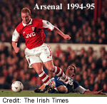 Nike were absent in 1992-93 but they swooped in to snatch the Arsenal contract away from Adidas in 1994. (This was adding insult to injury as between them Nike and
 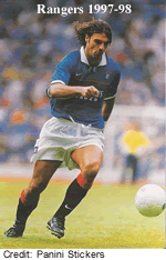 Reebok had reduced Adidas' share of the sportswear market in the USA from 70% to 2%). Their first offering was controversial because Nike's designers added too much red to the sleeves. As they became more familiar with UK supporters, they produced some attractive and memorable shirts over the next two decades. Rangers joined the Nike stable in 1997. While Nike's UK roster remained modest (they focussed more energy on signing up national teams) they with clubs that generated a lot of sales. Arsenal replica jerseys became the third highest seller globally in the Nike catalogue, shifting 800,000 units a year.
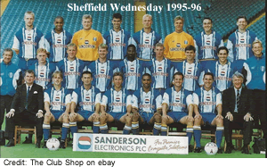 Adidas and Puma are bitter rivals, the origin of which stems from an acrimonious dispute between two brothers, Rudolph and Adolf Dassler during an Allied bombing raid in 1943. The rift was never healed and in 1947 Adi formed
 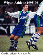 has own company, Adidas, and Rudi formed what would become Puma in their home town of Herzogenaurach. Puma signed up Sheffield Wednesday in 1993-94. Over the rest of the decade, Puma steadily picked up more contracts in England and latterly Scotand. Derby County and Wigan Athletic were added in 1995, Wolves and Leeds United the following season, Aberdeen
 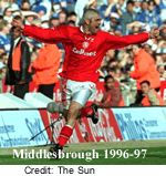 and Kilmarnock in 1998. It was a modest start from a company that would became a major player in the future.
Based in Parma, the Italian company Errea had built a reputation for stylish design since they were formed in 1988 by Angelo Gandolfi. Errea signed a sponsorship deal with Middlesbrough in 1994. The 1996-97 version 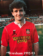 shown here had "Boro" picked out of the textured vertical stripe down the right hand side of the shirt and shorts. Five years later Brighton joined the fold.
EN-S appeared around 1986 and in 1992-93 they had four teams on their roster. They supplied a number of clubs in the lower divisions of the 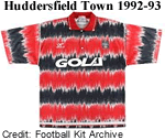 Football League, including Wrexham, until 1998. Another minor player was Gola who also had four clubs under contract that season after which they focussed exclusively on their core business which was and remains selling sports shoes. The change kit they made for Huddersfield Town ensured that they went out with a bang.
An unfamiliar brand made its debut in the Premier League in 1993-94. Pony (Product of New York) had been around since 1972 and was partnered 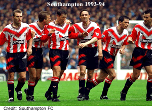 with a number of clubs in Mexico. Having signed up Southampton and West Ham United, they decided that they needed a gimmick to establish brand recognition. This came in the form of a large tick across the front of their shirts. While this did not look too bad on West Ham's otherwise plain tops it looked hideous combined with Southampton's stripes. In the following seasons Pony added Tottenham Hotspur and Coventry City to the roster with more conventional strips.
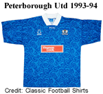 At least six clubs in 1992-93 opted to design and market their kits in-house although they would have out-sourced production so were not going to save money there. The logic here is obscure: there were plenty of companies who, as we have seen, offered complete creative control to their customers and were happy to produce bespoke kits to order with all the printing you might desire. If yours is a modest club in the lower divisions slapping your own brand on your latest polyester masterpiece seems little more than a vanity project unless of course you have the owner of a sportswear manufacturer on the board.
An interesting feature of the 1992-93 season is that around 30 clubs in England, that's almost a third, sourced their kit from small or local suppliers or adopted in-house brands.
The Home Nations
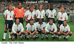 The most attractive deals for kit manufacturers were those with the major international football associations, and the contract with the Football Association was among the most desirable due to the sales generated and prestige attached to supplying the national side. Since 1984 the contract had been held by Umbro and in that time it had become normal for supporters to wear replica shirts to games, boosting sales. Having received strong criticism for changing kits annually, the FA and Umbro agreed to introduce a two-year cycle from 1997. Designers had to tread carefully, balancing the need to update the kit and keep it fresh while avoiding causing offence to traditionally-minded supporters. England's first choice strip for 1997-99 is a case in point. Red was reintroduced as an accent colour, there were bold flashes on the side of the body and shorts and the neat collar featured a miniature flag of St George. Most
  people liked it but there was criticism that the Umbro logotype overshadowed the smaller "England" that appeared below the re-worked three lions crest.
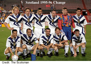
Most national teams have a preferred set of colours for their change kits - red and white for England, green and white for Germany, white/blue/red for France. Scotland used to change into white when required but since 1980 they had no settled alternative colours. This allowed Umbro's design team free reign when it came to the team's new change strip for 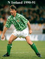 1995-96 and they went all in with a stunningly dynamic design.
In 1990 Umbro won back the contract to provide kit for the Northern Ireland team that had been held by Adidas since 1977. They marked their return with a unique, 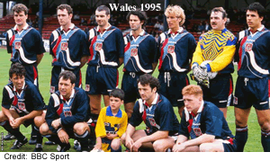 complex, geometric design that has become iconic. The change kit used the same pattern but in dark blue and white.
Umbro also supplied the FA of Wales with kit for the national team and in 1995 they broke with convention with a strip in dark blue-green with an abstract, swirling pattern on the shirt in white and red. Nothing like it had ever been seen in Wales before, nor anywhere else for that matter.
Accessorising
 Time was that the accessories on a player's kit were a big number on the back and perhaps the club crest on the front. A few enterprising clubs added numbers to players' shorts in the Sixties and in the early Seventies manufacturers' logos began to appear on shirts and shorts. Around 1978 crests were being added to teams' shorts. In 1982 sponsorship
  appeared for the first time and quickly became universal.
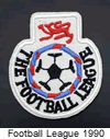
In 1990-91 the Football League introduced sleeve patches for the first time. These caught on very quickly and when the Premier League was launched in 1992 they introduced their own version. In 1994 the Nationwide Building Society sponsored the Football League and the first sponsored sleeve patches were introduced. The  Scottish Football League followed suit in 1994 and when the Scottish Premier League broke away, they brought in
  their own sleeve patches. Special patches were awarded to the league champions that were worn the following season and later on, they even specified which division the club was playing in.
The patches evolved over time to take into account changing sponsorship arrangements and the need to refresh their appearance from time to time. Patches were introduced for the various cup  competitions in England and were adopted by pretty much every league in the world as well as all the major international competitions.
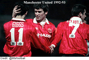 The launch of the Premier League in 1992-93 brought another innovation. For the first time, players' names were printed onto the back of their shirts. The following season the Premier League introduced a rule that players would wear squad numbers instead of the traditional positional numbering. The Football League followed suit in 1999-2000. This was without doubt a boon for spectators and commentators alike but there was also some pretty hard-headed commercial logic behind it. When fans went to buy the latest overpriced polyester threads they would now be confronted by the opportunity to personalise their purchase with the name and number of their hero and of course, the appropriate patches. Individually these seemed reasonably priced but add it all together and you could easily end up spending 20%-25% more than the basic item cost.
© Dave Moor (2024)