Skybet League One 2018 - 2019

You are welcome to Contact Me with corrections and additions.
Contributors are credited in brackets. Opinions expressed on this page are those of HFK and not contributors.

You are welcome to Contact Me with corrections and additions.
Contributors are credited in brackets. Opinions expressed on this page are those of HFK and not contributors.
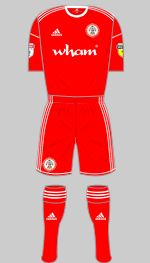
First
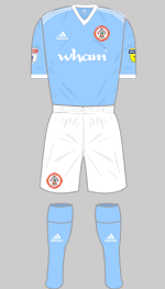
Second
It's been a long time coming but Stanley have won their first honour since they were promoted to the Football League in 2006 and make their debut in the third tier as League Two champions. They have retained their all-red strip and have introduced a new alternative. Both of these will be retained next season.
(Arthur Cowburn, @AndyhHolt)
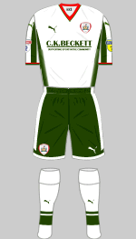
Third
The Tykes were relegated last season. As always they have made a conservative choice for their first strip but as Puma offer bespoke detailing this season, their crest is sublimated into the front of the shirt. The club mottos Spectamor Agendo (Let Us be Judged by Our Acts) is printed in red across the front of the black top.
Their popular white and green change strip is retained as third choice.
(Graham Siddons, Matthew Powell, Jordan Smith)
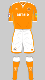
First
Second
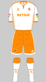
Errea's Eiger design is now used for both of Blackpool's strips (the change kit is held over from last season) and very smart they look. Due to the continuing fan boycott it seems unlikely that many replicas will be sold.
(Peter Gillat)
Second
Third
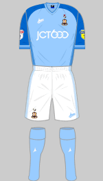
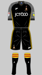
Few clubs are as restless as Bradford in constantly shuffling their traditional colours in search of new combinations. All-claret has featured a few times in the past but never before with black sleeves. I imagine they will return to stripes in a year or two. The alternatives are in the same template.
(Colin Russell)
First
Second
Third
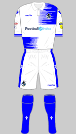
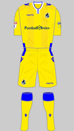
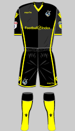
For the first time in a decade Rovers have sold their shirt sponsorship as opposed to raffling it off and their partner offers yet another way to part fools from their money. Presenting a sponsor's logo on Rovers' quartered shirts has always been problematic but separating the panels with a wide band like this ruins the design. And then we come to the awful streak effect: if you ordered a shirt by mail order and it came looking this this, you would send it back. This is quite their worst top since the 1996-97 Tesco carrier bag fiasco.
(Third kit to be confirmed.)
(Detenator
Ninety, MMA, David King)
First
Second
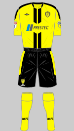
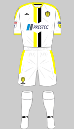
Albion were relegated last season and kick off in League One with a smashing pair of new strips in matching designs. Curiously the stripes on the second strip were reversed on the prototype shirt while the production versions are the same as the original CADs.
(@dbower87)
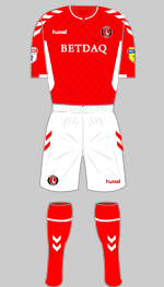
First
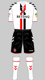
Second
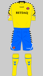
Third
The change strip was designed after consultation with "a number of fan groups" who picked out the kit by Quaser from 1994-96 as a favourite. Hummel have changed the horizontal red and black bands into vertical stripes that cross over behind the badge, a very original touch. There are also references to the past in what would otherwise be a standard template for the red and white strip. The chequerboard pattern was worn 1989-91 while the white side panels first appeared 1972 when they were a unique innovation. The third strip is the Hummel Authentic Charge design which has proved very popular in Scandinavia.
(Al Gordon, Stein Jacobsen, David King)
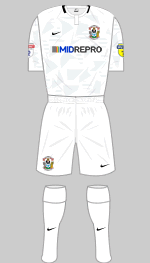
Second
Third
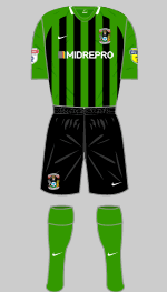
After just one season in the basement City bounced back and they knocked Stoke out of the FA Cup into the bargain. While things may be looking up on the pitch, affairs off it are still problematic and their future remains uncertain. The third kit reproduces an old favourite and was launched in October at the opening of the Bedworth & Nuneation Supporters' Club, part of an effort by the club officials to build better relationships with fans.
(Alisdair Gibbs-Barton)
First
Second
Charity
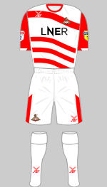
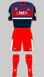
Doncaster go to a lot of trouble to wear something distinctive and unusual and this season we have wavy hoops and I rather like them. The red shorts and socks don't really work with the change shirt but they will match up well with the first choice top if needed. The shirts were originally to be sponsored by Virgin East Coast but after they walked away from the franchise, the new state-owned London & North Eastern Railway took over.
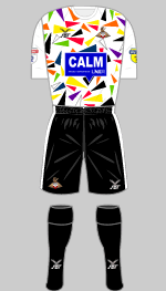
The club ran a competition for young fans to design a new charity shirt to raise awareness of mental health issues among children and young people. The winning entry came from 11 year-old Nate Nisar.
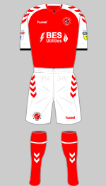
First
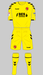
Second
Hummel's resurgence in the UK has reached the north-west coast. Their latest template is the basis for Fleetwood's usual red and white strip as well as the all-yellow reserve.
(Robert, David King)
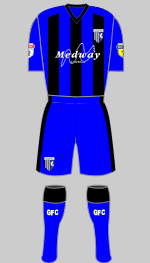
First
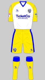
Second
Third
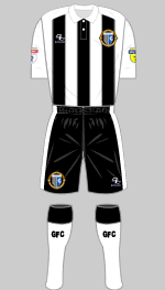
To mark their 125th anniversary this season Gillingham have reinstated their blue and black striped shirts, combining two of their historical colours. The decision to sponsor the club's first shirts has annoyed the Labour opposition on Medway Council who question whether money should be spent in this way when services are being cut. Their change strip is very striking and puts me in mind of Torquay United. The third strip reproduces their original colours as New Brompton and has a special crest. There is no shirt sponsor on this set which was supposed to be worn just once, in the opening fixture. In fact at appeared again at Walsall a week later.
(Chris Matterface, Lee Capeling, Craig Ridley)
First
Charity
Second
Third
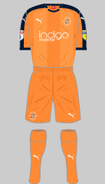
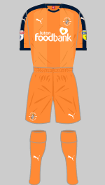
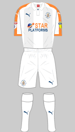
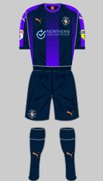
All-orange is a new look for Luton who were promoted last season. The Puma form stripe retains the element of navy blue but is a very dark shade. The white change strip looks well with orange trim and the third kit features a fade effect in the stripes.
(David King)
First
Second
Special
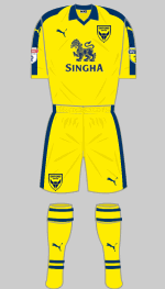
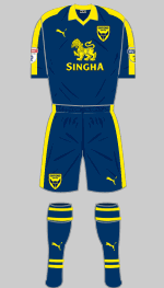
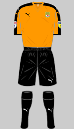
It's Oxford's 125th anniversary so as is customary, a new crest has been introduced. The team have gone back to all-gold trimmed in "peacoat navy" which looks smart. Since the alternative is simply reversed we can look forward to the team turning out in various conbinations of yellow and navy as the occasion demands. Now isn't that just sensible.
The special edition kit was worn on the club's 125th anniversary
and is in the orange of the original Headington United club, whose crest appears.
(Graham oxfordkits)
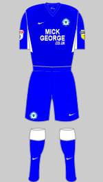
First
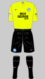
Third
Supporters chose the white change kit from a short list of three, all standard Nike catalogue designs. There's not a lot to say about the all-blue strip other than it Nike's new Tiempo Premier template. Last season's "solar yellow" and black strips was pressed into service for the visit to QPR.
(Bruce E Bailey, Juraj Gudába, MMA)
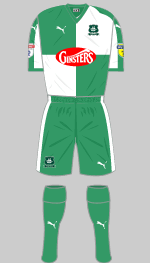
Second
Green and black stripes first appeared in the Pilgrim's kit hamper in 1973 but were dropped after four months because they did not show up under floodlights. Nevertheless, they have returned from time to time and seem popular with supporters. Matching them with white shorts and socks should avoid the players becoming invisible during evening games.
Fans are especially pleased that Ginsters have dropped their red/white logo, which always clashed with Argyle's tops in favour of an elegant new version in white. the decision to use "pepper green" in the change strip is an interesting one but it should work. Our correspondent tells me that on balance, supporters like it.
(Craig Morris, Michael Grimley)
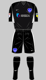
Third
Although the new first strip is in Portsmouth's traditional colours the switch from Sondico to Nike and a new shirt sponsor give it an unfamiliar look. There is also a subtle camo pattern printed into the shirt and a revised crest. The choice of white/blue/blue for the change kit means the team can avoid most colour clashes by swapping shorts and socks around but a third kit will be needed for the visit to Bristol Rovers.
Former Disney executive Michael Eisner, who now owns the club,
rejected more lucrative sponsorship in favour of the local university in order to encourage more people into higher education. At a time when gambling businesses are making ever deeper inroads into elite sport this is a refreshing attitude which we here at HFK Towers applaud.
(Diamond One, Gabriel R, Harry Fripp, Jake Smith, Ben Gershaw)
Second
Third
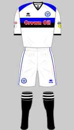
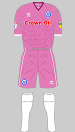
Blue and black stripes are back, a popular style that appeared for the first time ten years ago
to represent Dales' two historical colour schemes. Because it's 2018 the latest version has graded stripes with a geometric pattern embossed into the fabric. Second choice is rather smart and rearranges the colours to be predominantly white. For the third kit they have really gone for it.
(Chris Harvey, Henry France, Mark Wilbraham)
First
Second
Third
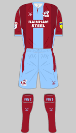
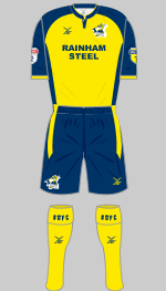
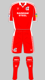
It must be difficult to come up with a fresh way to arrange Scunny's claret and blue colours but FBT have managed it. The navy and yellow outfit provides sufficient contrast but a third strip is planned. Rainham Steel return as the club's shirt sponsor now that British Steel's contract has expired. The steel stockholders were previously featured on the team's shirts between 2007 and 2015. The red strip was proposed as an option in the fans' vote to mark Sir Ian Botham becoming club president (Beefy played for the Iron in the 70s when they wore all red). Although it didn't attract enough support to become first choice it was suggested that it be made third choice.
(Richard Young, MMA)
Second
Third
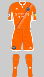
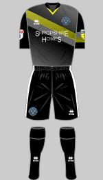
Errea are in the final year of their contract and have delivered a rather elegant first strip with stripes that extend on to the back. This was worn in the play-off final last season. The orange change strip has proved popular and is kept while a third strip in the "Athens" design, with complicated textures and fade effects, is introduced for the first time.
(Diamond One, David King)
First
Second
Third
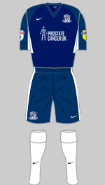
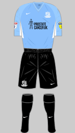
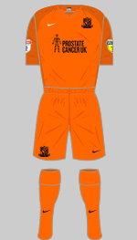
Southend's chairman, Ron Martin has decided to continue using the front of the team shirts to support charitable causes, for which we salute him. The choice of black shorts for the change kit is odd as they are so similar to the navy ones that an alternative is likely to be needed whenever the visit sides wearing dark shorts and indeed a white set appeared at Burton. The orange strip was required for the visit to Wycombe.
(Alec Hitchman, MMA, Ben Gershaw, Austin Wilks)
Second
Third
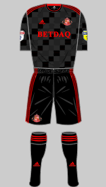
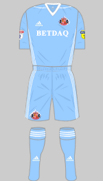
This is only the second time in their history that Sunderland have been in the third tier and supporters are hoping they can emulate their predecessors who bounced back after just one season 30 years ago. To that end the chairman has cleared their debts and sacked the manager before making way for new owners. Red shorts were registered as part of the fresh start but I can't see them being around for long. Indeed, just one week after the new chairman stated they would definitely be wearing them in the league, as a result of fan pressure, the club got permission from the EFL to wear black in their home games with red worn in away games.
(Robert, James Gray, paul.c55, Peter Wilson, Chris Waters SAFC)
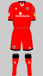
First
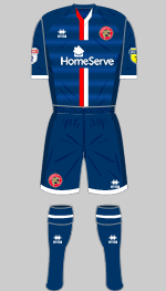
Second
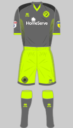
Third
The Saddlers are staying with the all-red look but with a bit more black trim and less white. The alternative is rather striking and features fading horizontal bands. The third strip reminds me of those awful lime and licorice sweets we used to waste our pocket money on and which turned your tongue black.
(Detenator Ninety, David King)
Wimbledon complete the transition to Puma kit this season. Plain blue with yellow applications is first choice while the alternative is yellow with blue form stripes.
(Tony Sealey, Mark Randall, David King)
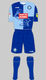
First
Second
Third
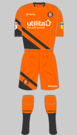
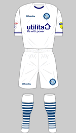
Promoted Wycombe have got a wonderful new first kit to show off this season. The fabric has a marl pattern printed into it and the club's swan emblem is reversed out on the front. It's just a shame that the effect is ruined by the clashing sponsor's logo. The other kits are retained from last term.
(Ed Goode, Dave Peatey)