The Premier League 2016 - 2017
 The Premier League has sold its television rights for a record £5.136bn, an increase of 71% on the previous deal. This staggering amount means that there is no real incentive for title sponsorship any more so the competition is now simply styled as The Premier League and has a new visual identity. In the accompanying video subtitles note that "We all have a part to play...every fan...every player...everyone." The 10,000 supporters who walked out of the Liverpool v Sunderland match in February in protest against the increase in match tickets from £59 to £77 and £1000 for a season ticket, might take a different view.
You are welcome to Contact Me with corrections and additions.
Contributors are credited in brackets. Opinions expressed on this page are those of HFK and not contributors.
Premier League | Championship | League One | League Two

First

Second

Third
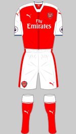
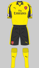
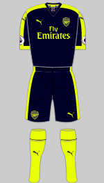
Designer: Puma
Sponsor: Emirates Airlines
The Gunners finished as runners-up which might be cause for celebration for most clubs but Arsenal supporters expect trophies, so Arsene Wenger is now under pressure.
Puma's new first strip is OK I suppose.
It's basically a standard Puma design with a bespoke collar and a dark red stripe down the front. The change strips were launched in Los Angeles during the team's North American tour. Familiar yellow is now teamed with grey rather than navy while the third strip is in "peacoat blue" and neon yellow.
(Lawrence Emmanuel, Nik Yeomans)

First

Second

Third
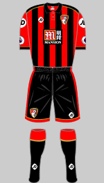
Designer: JD Sports
Sponsor: Mansion Poker.com
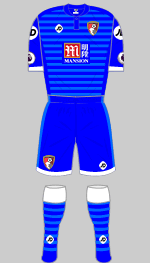
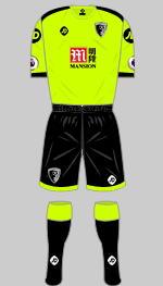
The Cherries can be more than satisfied to have retained their place in the Premier League. JD Sports have updated their now iconic red and black strip which has gold trimmings once again. Gabriel R wonders if this is to match the colour scheme of their shirt sponsor.
(Travis Hogarth-Colby, Gabriel R, Muhammad Iqbal bin Kamarudin, Alexander Leiberich, Diamond One)

First

Second

Third
Designer: Puma
Sponsor: Dafabet
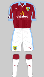
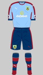
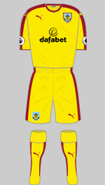
Burnley are back in the Premier League as winners of the Championship title. Their new first strip is not very different from last season's but is now worn with white shorts, which looks much better. I'm not sure about the change strip. Sky blue sjorts and socks were worn several times in the first half of the season before the official version appeared at Stoke in December. Last season's yellow change shirts were worn with matching shorts and socks at West Ham.
(Alexander Leiberich, Diamond One, Jack Henderson, Benjamin Raynor, Ralph Pomeroy)

First

Special
15 May v Watford

Second

Third
Designer: Adidas
Sponsor: Yokohama Tyres
Chelsea have paid Adidas £54m to cancel their kit deal which was due to run until 2023. At £30m a year this was the biggest contract of the lot in 2013 but was later eclipsed by Manchester United's £750m and Real Madrid's £1bn, both over 10 years. The club wants to pursue something similar.
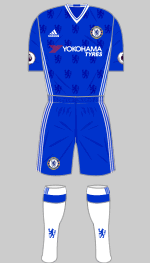
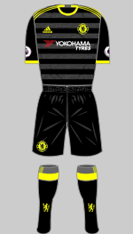
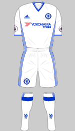
Adidas' last offering is faithful to the traditional Chelsea look with lions rampant printed into the shirt fabric and the iconic three stripe trim down the sides of the body. The change kit is black with textured grey hoops on the front of the shirt and neon yellow trim.
(David Niblock, Rhys Byron, Nik Yeomans)

First

Second
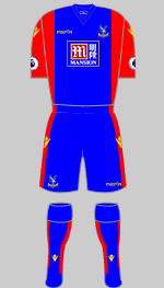
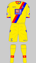
Designer: Macron
Sponsor: Mansion Group
The FA Cup finalists are again wearing striking outfits designed by Macron. The red/blue sash is a favourite with supporters and is now combined with yellow, another popular choice for change strips in the past.
(Travis Hogarth-Colby)

First

Second

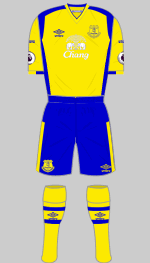
Everton
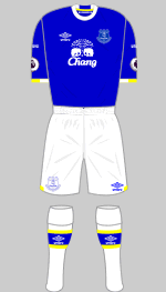
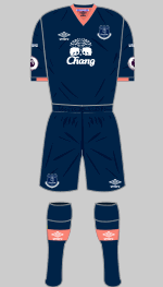
Designer: Umbro
Sponsor: Chang Beer
A classic crew neck takes us back to the 1960s while the yellow accents are a reminder of the mid nineties. Not bad at all. The change kit is dark navy with salmon pink trim, another nod to history, this time 1890-91. Yellow and blue is always a popular choice for change strips but prinnting the Chang logo in white renders it almost invisible.
(Andrew Mihaleff, Diamond One)

First

Second

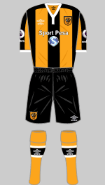
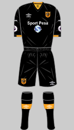
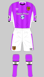
Hull City
Designer: Umbro
Sponsor: Sport Pesa
Hull are appearing in the Premier league once again after winning through the play-offs. Their Umbro designed first strip reverts to stripes and I like the contrasting white collar and cuffs, a detail that appeared in the 70s. The change strip is all black so presumably there are some amber shorts in the cupboard. The third kit was revealed at Bournemouth and is in purple cactus (no less) and white.
(Diamond One, Lukman Rewa)

First

Second

Third
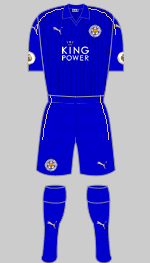
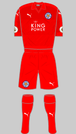
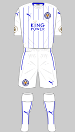
Designer: Puma
Sponsor: King Power
Leicester City are the Premier League Champions. No matter how many times you say it or see it written down, it remains hard to believe. Fittingly, they are wearing all blue again but now with subtle gold piping while the change strip is now red. Both shirts have a subtle striped pattern printed into the fabric. A third kit will be needed at Crystal Palace and will also be worn in Europe if required.

First

Special
17 Oct v Man Utd

Second

Third
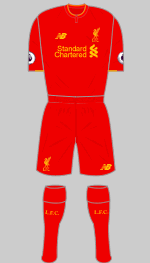
Designer: New Balance
Sponsor: Standard Chartered
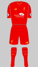
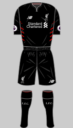
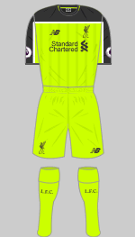
Yellow first featured has been an accent colour in Liverpool's strips since the glory days of the 1970s and has been a regular feature ever since. The black second strip has silver trim to commemorate the first of Liverpool's five European Cup wins.
In addition to the usual nonsense about the shirt technology the marketeers have come up with something new: the socks have built-in comfort zones while the foot-bed has been developed with polypropylene to help alleviate excess moisture when the foot makes contact with the boot. Not just socks then. The colour of the third kit is officially, and without a trace of irony, called "toxic."
(Andrew Mihaleff, Diamond One)

First

Second

Third
Designer: Nike
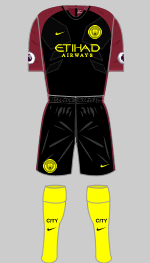
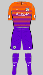
Sponsor: Etihad Airways
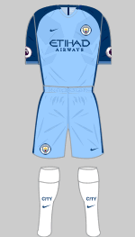
Supporters had to be satisfied with the League Cup last season. Instead of a bespoke outfit, the team are wearing Nike's ubiquitous Vapor design. The yellow on the ugly change strip is supposed to represent a worker bee, which appears on the Manchester....hang on. Adidas came up with a bee motif for United's shirt. If you thought these were bad, the third set is worse.
(Diamond One, Adam Dove, Andrew Mihaleff)

First

Second

Third
Designer: Adidas
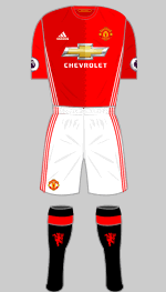
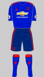
Sponsor: Chevrolet
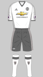
Blue frequently appears in United's kit hamper and here we go again. The shirt and socks have a fine fibre print that supposedly resembles old fashioned fabric (or "cotton" as we experts describe it). I am not keen on the red trim: white would have looked better I think. The first choice shirt is in two tones of red (a reminder, we're told of Newton Heath LYR's original halved jerseys). A nice touch is the honeycomb motif that runs down the front of the shirt uniting the two halves, inspired by the bees on the Manchester coat of arms. You've got to hand it to Adidas; they do talk a good design. The third strip is white and grey and that motif down the shoulders and sleeves? Honeycomb.
(Alexander Leiberich, Lukman Rewa)

First

Second

Third
Designer: Adidas
Sponsor: Ramsdens
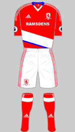
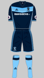
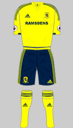
Promoted 'Boro are sporting the latest Adidas Regista shirts but mercifully have not opted for the matching shorts. Blue has previously featured in the Nineties but to my mind, it looks out of place. The change strip features a graded chevron which first appeared on Houston Dynamo's latest change strip and is in "indigo and bright cyan." Last season's yellow and dark navy strip was used at Crystal Palace.
(Jack Henderson, Sytse Korts)

First

Special
17 May v Man Utd

Second

Third
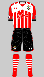
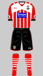
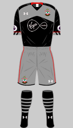
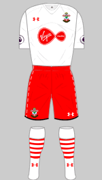
Designer: Under Armour
Sponsor: Virgin Media
After the disappointingly unoriginal Adidas kit of last season, this is much more like it. The stripes continue on the reverse of the first choice shirt and are set off by an innovative yoke on the front that is repeated on the change strip. The red trim sets off what would otherwise be an austere black and grey alternative.
To comply with UEFA regulations, the Saint's first shirt is solid red on the back for European games.
The third strip was introduced for the match at Bournemouth.
(Diamond One, William Geddes, Tony Sealey, Bill Reynolds, Nik Yeomans)

First

Second
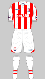
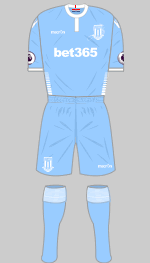
Designer: Macron
Sponsor: bet365
Stoke have signed up with Macron who have served up a decent first strip and a light blue alternative that comes out of their catalogue.

First

Second

Third
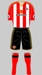
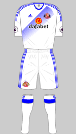
Designer: Adidas
Sponsor: Dafabet
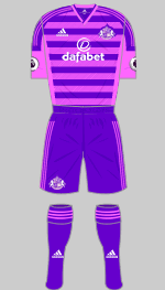
Sunderland narrowly avoided relegation and supporters will not be too disheartened that Newcastle went down instead. The first strip is once again a bog standard Adidas template with gold trimmings to give it some individuality. The white change shirt is adorned with an interesting graded sash while the third strip is an understated combination of bright pink and deep purple.
(Graham Brack, Diamond One, Travis Hogarth-Colby)

First

Second
Designer: Joma
Sponsor: BetEast
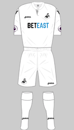
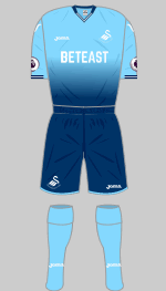
Swansea have signed up with the Spanish manufacturer, Joma, who can be relied upon to offer distinctive outfits. The first choice strip is absolutely minimalist with black confined to the detailing including a nice striped inner plaquet at the collar. The alternative features the fading effect which is proving popular this season and is described as turquoise and navy.

First

Europe

Special
14 May v Man Utd

Second

Third
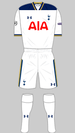
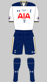
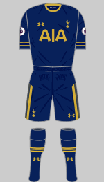
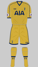
Designer: Under Armour
Sponsor: AIA
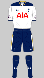
Under Armour have quickly developed a reputation for fine and original design, in contrast to the big three, who offer little more than variations on their standard templates. Spurs' new set displays some well thought out individual design features on each strip and at the same time is unified by the use of old gold and navy throughout. Absolutely outstanding.
The special kit was worn in Spurs' final match of the season
which marked their last at White Hart Lane. Match worn shirts were auctioned off after the game in support of the Tottenham Tribute Trust whose logo appears on the front.
(Diamond One, Nik Yeoman)

First

Second
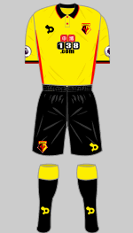
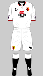
Designer: Dryworld
Sponsor: 138.com
Newcomers Dryworld are providing some very well designed strips and their offerings for Watford are a good example. Reminiscent of the late 80s, they feature a neat collar and discrete red trim.
(Eric O'B)

First

Second
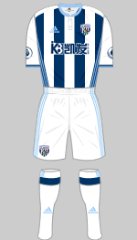
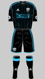
Designer: Adidas
Sponsor: UK-K8.com
Light blue trimmings set Albion's new first kit apart from anything they have worn in the past. The shirt is all-white on the back. The change kit is black with "cyan" trim.
(Mike Teague, Diamond One)

First

Second

Third
Designer: Umbro
Sponsor: Betway
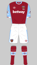
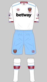
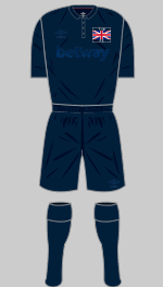
The Hammers kick off the season in their new home, the Queen Elizabeth Olympic Stadium. Umbro have added lots of detailing to the change strip to mark the occasion. The ground's name is inscribed underneath the brand new crest and its coordinates are printed below the rear of the collar on the inside of the shirt along with a stylised union flag motif which also decorates the cuffs. The "home" strip is decent enough although there is rather a lot of detailing for my taste. The third strip is a copy of the original Thames Ironworks outfit from 1896, even down to the badge. It was commissioned for a pre-season match with Juventus to mark the opening of the Olympic Stadium and will also be worn in the FA Cup. Note that the makers' and sponsor's logos are toned right down so as not to detract from the purity of the design.
(Andrew Braybrook, Alisdair Gibbs-Barton, Eastlygod)
 The Premier League has sold its television rights for a record £5.136bn, an increase of 71% on the previous deal. This staggering amount means that there is no real incentive for title sponsorship any more so the competition is now simply styled as The Premier League and has a new visual identity. In the accompanying video subtitles note that "We all have a part to play...every fan...every player...everyone." The 10,000 supporters who walked out of the Liverpool v Sunderland match in February in protest against the increase in match tickets from £59 to £77 and £1000 for a season ticket, might take a different view.