2020 UEFA European Football Championship
 Postponed from June 2020 because of the Covid-19 pandemic, the tournament was conceived as a one-off event to celebrate the 60th anniversary of the European Championship. Instead of being hosted in one or two countries, Euro 2020 would be held in multiple cities across the continent. In September 2014 UEFA announced that thirteen cities had been selected with the semi-finals and final to be held at Wembley Stadium. Due to delays in building the new Eurostadium, Brussels was removed as a host city in December 2017 and the four matches scheduled to be played there were reallocated to London.
Despite restrictions on public gatherings and international travel, UEFA announced in October 2020 that the tournament would go ahead as planned in June/July 2021 although it might be necessary to reduce the number of venues and restrict attendances. As vaccination programmes were rolled out in 2021, UEFA asked host cities to draw up spectator plans in conjunction with their local health authorities and government agencies. Nine of the twelve tournament hosts confirmed their plans in early April with stadium capacities ranging from 25% to 100%. Bilbao, Dublin, and Munich were given an extension to submit their plans after which Bilbao's matches were reallocated to Seville while Dublin was removed and the four matches due to be played there were moved to Wembley.
In March 2021 UEFA's Executive Committee approved the use of up to five substitutes in matches with a sixth permitted in extra-time. For the first time the Video Assisted Referee (VAR) system would be in place.
Group A | Group B | Group C | Group D | Group E | Group F | Knock Out Stages
Euro 2020 Index
European Championship Index
Group A
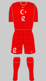
 Turkey
First
Second
Designer: Nike
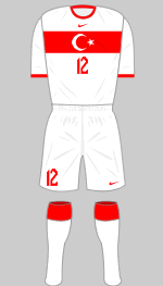
Nike have provided a very fine first strip in a firmly traditional design. The crew neck and lack of frills evokes a 1960s retro look. The alternative is the same design in two tones of red.
 Italy
Italy
First
Second
Third
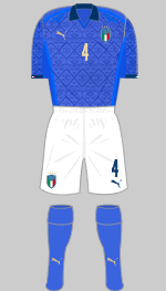
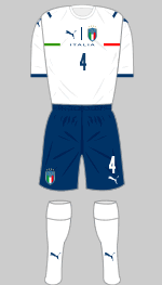
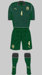
Designer: Puma
Puma have taken inspiration from the Italian Rennaissance, the period when Italian art, literature, music and architecture redefined European culture. Such high concept marketing is easy to mock but it cannot be denied that the strips themselves, with their ornate jacquard prints, look stunning. Unfortunately, on the eve of the tournament, Puma launched new second kits for the teams on their roster. Pedestrian, unimaginative and designed round a single template, these can only be described as a cynical attempt to cash in at the last moment.
 Wales
Wales
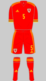
First
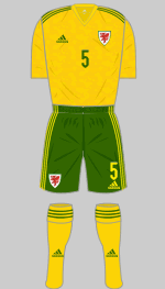
Second
Designer: Adidas
The Dragons appear for the second time in the Euro finals and supporters hope they can equal the achievements of 2016. Now ranked 17th in the world and despite the absence of manager Ryan Giggs due to legal issues, the team won promotion to League A for the 2022-23 UEFA Nations League.
Yellow and green is a popular choice for change strips but the shades
in the latest effort remind me more of the Australian national team.
 Switzerland
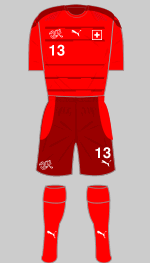
First
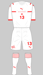
Second
Designer: Puma
The choice of dark red for the shorts and trimmings on Switzerland's first choice strip is a bold and radical new look but Puma's designers really had fun with the change strip, with stripes on the shirt, arranged to suggest an Alpine landscape and made up of tiny Swiss crosses, representing the four official languages of the Confederation, French, German, Italian and Romansh. Sadly this interesting strip was replaced on the eve of the competition with Puma's new international template. Unforgivably the Swiss authorities have allowed Puma's logo to dominate over their own national flag.
Group B
 Denmark
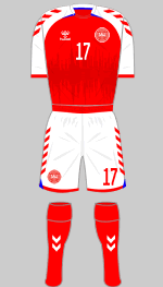
First
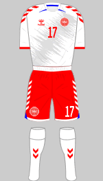
Second
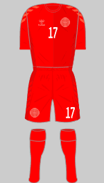
Third
Designer: Hummel
The gimmick on Denmark's new kits is a soundwave graphic, created from a recording of over 34,000 Danish supporters belting out their national anthem before a game against Ireland in June 2019. Altogether now:
Der er et yndigt land,
det står med brede bøge
nær salten østerstrand :|
The third kit has a graphic on the chest inspired by their iconic 1986 shirt.
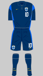
 Finland
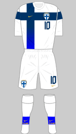
First
Second
Designer: Nike
This is the first time that Finland have appeared in the finals of any major international tournament. It is therefore fitting that they should have a memorable first choice strip to wear that reflects the nation's flag. The change strip is a bog standard Park Derby III design.
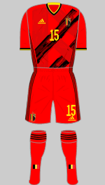
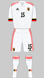
 Belgium
First
Second
Designer: Adidas
The Belgian team often wear flamboyant strips and their latest all-red outfit is certainly in that mould. The brush stroke graphic forms a stylised "B." The change strip is the latest Condivo 20 design in off-white. The set is finished off with a new crest.
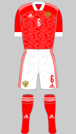
 Russia
First
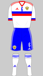
Second
Designer: Adidas
The Russian FA refused to accept the first batch of Adidas' new Soviet-style red and white strips when they were delivered last November because the sleeve trim, which was blue over white, resembled the Serbian flag when combined with the red sleeves. The replacement has a large cuff that is just white. The colour sequence on the change strip is, however, correct.
Group C
 Netherlands
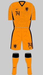
First
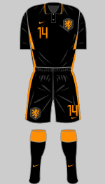
Second
Designer: Nike
Nike's Park Derby III template makes another appearance but with a novel twist on the orange first kit. The elaborate graphic on the body represents a lion's head (the lion has been the national emblem since 1907). This continues onto the reverse where it takes the form of the back of the lion's mane. Nike seem inordinately pleased with themselves for creating this 360˚ graphic.
 Ukraine
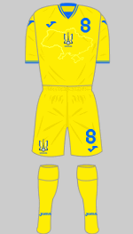
First
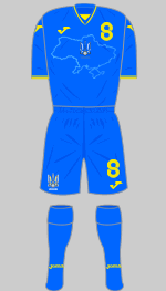
Second
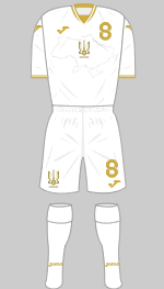
Third
Designer: Joma
Shortly before the Euros were scheduled to begin, the Ukrainian Football Federation launched new kits that caused outrage in Russia. Feaured as a jacquard print on the front of the shirts is an outline of Ukraine that includes the territories of Crimea, illegally annexed by Russia in 2014, as well as the Donetsk and Luhansk regions where Moscow-backed rebels have been fighting an insurgency against the Kiev government for the past six years. On the reverse of the collars are the words Слава Україні! Героям слава!, (Slava Ukraini! Heroiam slava! Glory to Ukraine! Glory to the Heroes!), a phrase that first appeared early in the 20th century and became a rallying cry for Ukrainian independence. Russian protests that the shirts were overtly political were brushed aside by UEFA, although they later required the Glory to Ukraine! slogan to be removed.
 Austria
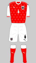
First
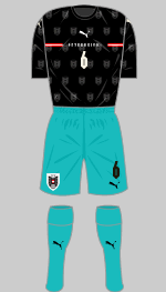
Second
Designer: Puma
Puma's Euro kits were promoted under the "Created from Culture" theme and in this case, the inspiration is the Vienna Secession art movement of the late 19th century. The art nouveau style is represented in the red and white shirt by tiny fan-shapes that are too small to make an impression from any sort of distance. The elegant motif on the black change shirt was made up of a repeated feather pattern and was more effective but this was replaced at the last minute by the latest bog standard away kit template. Personally, I'm furious - it took me forever to draw the previous version.
 North Macedonia
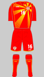
First
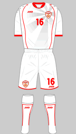
Second
Designer: Jako
Last November North Macedonia beat Georgia in the play-offs to reach the finals of a major tournament for the first time. Seeking to capitalise on this success, the Football Federation commissioned Jako to prepare new playing kit fit for the occasion. Days after these were launched at the end of May, Muamed Sejdeni, the president of the FFM took to Facebook to apologise to supporters who were outraged that the new jerseys were a shade of burgundy rather than the familiar red and gold. Sejdeni's statement was a classic example of the non-apology: "The technical support regarding the colour of the jersey is not in accordance with the requirements of the FFM. The ...FFM takes full responsibility for this choice but will also demand responsibility from the techincal partner." So not quite "full responsibility" then.
The old kits introduced in 2018 have been pressed into service and very good they look too.
Group D
 England
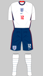
First
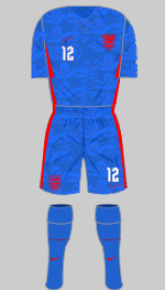
Second
Designer: Nike
Due to the suspension of of professional football last year and the consequent postponement of Euro 2020, the launch of England's new strips was held back until September. The Park Derby III design is used for both (with the addition of a little red trim on the flashes down the side of white shirt) but what on earth were the FA thinking when they approved a blue change strip? Every student of England's kits down the years knows that the team have never performed well in blue. Indeed the colour is forever associated with England's embarrassing 1-0 defeat by the USA in the 1950 World Cup.
 Croatia
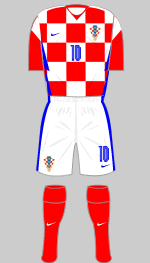
First
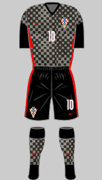
Second
Designer: Nike
The unfortunate thing about Croatia's unique checkered shirt is that it clashes with so many of their opponents. Although the team reached the final in the 2018 World Cup, their red and white jersey appeared just twice and in Euro 2016 it was worn only once in four outings. The alternative appears to be designed to make the wearer invisible on a foggy night in Zagreb.
 Scotland
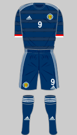
First
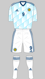
Second
Designer: Adidas
This is the first time that Scotland have reached the finals of a major tournament since 1998 and they did it by the skin of their teeth, beating Israel and Serbia on penalties in play-offs. The prospect of playing two group matches at Hampden Park as well as meeting the Auld Enemy at Wembley have revived the spirits of the Tartan Army after 23 years of disappointment. It's a shame they will grace the finals wearing such nondescript strips.
 Czech Republic
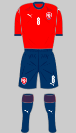
First
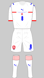
Second
Designer: Puma
In keeping with Puma's "Created from Culture" theme, there are subtle geometric graphics (too subtle for me to to reproduce here) on the shirts of both strips that are inspired by the leaves of the lipa (linden) tree. This, according to the marketeers at Puma, is a Slavic symbol of freedom. This came as news to my Slavic wife who informs me that the principal cultural significance of this noble tree is that it provides excellent honey. The linden is also known as the lime tree in the UK, hence the apalling change strip. Unfortunately, Puma replaced the Lipa kit at the very last minute with one of their dreadful new templates but I'm leaving the joke here because I thought it was quite good.
Group E
 Spain
Spain
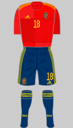
First
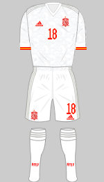
Second
Designer: Adidas
Spain's new first choice shirt is an odd affair featuring blocks in various shades of red. It's supposed to be based on the national flag but I don't see it. The alternative is white with grey trim and a pale grey graphic printed into the shirt.
 Sweden
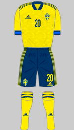
First
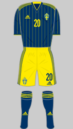
Second
Designer: Adidas
Sweden are wearing their usual colours but the blue is now a very dark shade. The elements of each strip are interchangeable, which always comes in handy given how fussy officials are about colour clashes. The pinstripes on the change shirt give this one an Eighties vibe.
 Poland
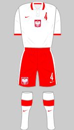
First
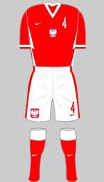
Second
Designer: Nike
There are no fancy graphics or gimmicks involved in Poland's Euro kits which makes for a refreshing change. Nike have stuck with tradition, adding embellishments from their stock catalogue.
 Slovakia
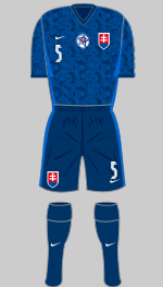
First
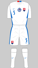
Second
Designer: Nike
Slovakia have switched their colours round since they appeared in Euro 2016. Dark blue is now first choice with a complex graphic on the shirt that is supposed to evoke the country's mountainous landscape. The all-white alternative has Nike's latest trim embellished with folk symbols embossed into the fabric.
Group F
 Hungary
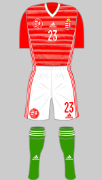
First
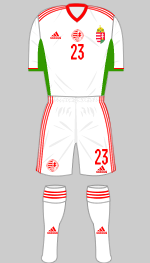
Second
Designer: Adidas
The graphic on the red first choice shirt is supposed to evoke the waves on the Danube. Apart from that flourish, Hungary's kits are straightforward Adidas templates in traditional colours.
 Portugal
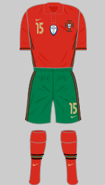
First
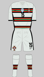
Second
Designer: Nike
Portugal, the European champions, have reverted to green shorts for the first time since 2006. A shade of deep red is once again chosen for the first choice shirt which I suppose evokes port wine. Flamboyant change strips are very much a thing for the Portuguese (the all-white 2018 World Cup strip was the exception that proves the rule) and for this tournament they are wearing pale teal with horizontal bands. Black has been added to the trim for the first time to add a new degree of contrast.
 France
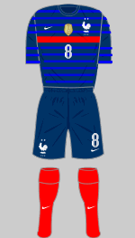
First
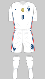
Second
Designer: Nike
The red band on the French first choice shirt has a pedigree that goes back to Euro 84 when the team won their first international title. It's a shame it's worn with dark blue shorts as I think it would look better with the white set from the change kit but it's all part of the trend for having one dark and one pale kit I suppose.
 Germany

First

Second
Designer: Adidas
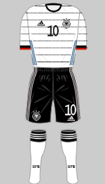
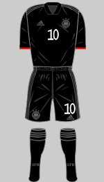
The bond between Adidas and the German national team is absolutely unshakeable. As usual the kit designers have come up with a traditional design with some modern twists. In this case we have horizontal pinstripes with a textured brushwork effect and the national colours worn at the sleeve cuff. The alternative is an outrageous affair that resembles the proverbial black cat in an unlit cellar at midnight. Only the squad numbers and player names on the back of the shirt are in contrasting white. I'm pretty sure that if UEFA's regulations allowed it, these would be invisible too.
 Postponed from June 2020 because of the Covid-19 pandemic, the tournament was conceived as a one-off event to celebrate the 60th anniversary of the European Championship. Instead of being hosted in one or two countries, Euro 2020 would be held in multiple cities across the continent. In September 2014 UEFA announced that thirteen cities had been selected with the semi-finals and final to be held at Wembley Stadium. Due to delays in building the new Eurostadium, Brussels was removed as a host city in December 2017 and the four matches scheduled to be played there were reallocated to London.
 Turkey

 Italy
Italy


 Wales
Wales

 Switzerland

 Denmark


 Finland

 Belgium

 Russia

 Netherlands

 Ukraine


 Austria

 North Macedonia

 England

 Croatia

 Scotland

 Czech Republic

 Spain
Spain

 Sweden

 Poland

 Slovakia

 Hungary

 Portugal

 France

 Germany